Here are some CV examples I found online that drew my attention.
The example above I like because of the colours used and the decoration around the edges. But what I didn't like was the way the text was used. It looked to small and boring. The information was relevant but I preferred looking at the illustrations rather than the information on the person.
I liked the one above for the use of black and the distorted paper. I like that it isn't neat and there are drips and spills on the page along with some creative illustrations. It really shows of the individuals personality.
The example above I thought was one of the best examples that described me. I liked the use of the image and the pattern overlay of polka dots. I liked the use of pastel colours. The text is relevant and very minimalistic.
I had a look at this example because it shows referenced from his mum and dad, handwritten noted and business cards. I could think about making my own card? or logo? I could scan in images or written bits.
If I could get away with creating and drawing myself something like this I would do it. I thought it was funny and sweet. But I don't think I would be confident enough to create something like this and make it as funny as this. It could either work really well, or be really bad.
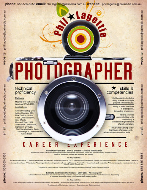
If I could find an object that related to what I want to do that would be able to give the same affect off as the camera in the image above I would do it. It works really well with the camera!
I liked this one because again, I must just love the pastel colours. I like how the illustrations look hand drawn and in pencil, which is related to what the individual is specifying in. It is very basic, sweet and elegant.
I would love to use scrabble letters! Somehow I would like to feature them in my CV, This is a front cover for someone portfolio, It spells out 'Harriet Louise Mills' it isn't obvious but I love the way she has tried to show this.


No comments:
Post a Comment