Monday, 30 April 2012

PROJECT 1 - JACK WILLS

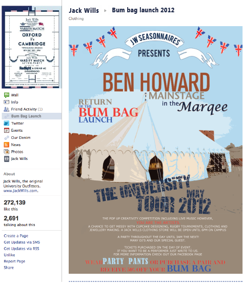
This project was the semester long brief in semester 1. My idea was to bring back bum bags for Jack Wills and change the target market for the backs. Aiming at the student age, I also designed an idea for an event where the bags could be promoted. It was a British music & creativity based event for the university market.
This is the example of the poster/ leaflet below!


Promotional Poster


Above is a form of promotion on the Jack Wills website.

Form of promotion on a social network. 


This was the front cover to the report I wrote for the project. Inside featured all about the product, the brand, what the bag is make from, the price, the style and look, the market segments, the promotional campaign and event.


The image above is the front cover of the press pack for the bag. Inside features a small brief introduction about the brand, about the product, the customer and the event. This is what would be sent out to buyers, journalists and press.


Creative CV Tips

Creative Resume Tip #1: Remember it’s a Business

Yes, it’s important that you have great creative talents and that people love your work, but you’re there to help the organization succeed. If you’re a graphic designer, your designs are supposed to drive revenue or profit gains. If you’re a music producer, your audio is supposed to do the same.
No matter what your creative profession, you are using your creativity towards an end goal. And you must keep that end goal in mind when you write your resume. Show employers that you know how to harness your creativity to help the organization succeed.
(This is why it’s important to try to find out the results of your work if people don’t usually share it with you. Keep a record so that when you have to write a resume, it’s easy to do).

Creative Resume Tip #2: You can be a Little Different

Don’t be stuffy or too formal with your resume design and layout. Being in a creative field gives you a little more leeway than someone who works as an accountant.
Use colors. Add a personal logo if you have one. If you’re a graphic designer, think about ways you can demonstrate that skill. If you are an illustrator, consider using one of your drawings in the resume. A fashion designer might include a design sketch. And no matter what profession, include a link to an online portfolio of your work.

Creative Resume Tip #3: Don’t be Too Different

You must strike a delicate balance with your resume. A little creativity is good, but too much can obscure your message.
When thinking about how you can spice up your resume, keep your value proposition and strategy top of mind. (Not sure how to develop a value proposition? Take our free email course and learn how).The key is to use creativity to enhance your message not obscure it.
Also, be aware of constraints if you will be emailing your resume. You must send a MS Word version because PDFs are not readable by applicant tracking systems (meaning your resume won’t be found months from now when the company scans its resume database looking for a designer). And when you email Word documents, your documents can lose their formatting if you don’t use common system fonts.
I work on a Mac but many of my clients are on a PC. Fonts I have found to travel well include Arial, Times New Roman, Georgia, Tahoma and Trebuchet.

Creative Resume Tip #4: Put Yourself in the Manager’s Shoes

This isn’t really a tip just for creatives , it applies to everyone. When writing your resume, forget about yourself and what you want and start thinking about the hiring manager and what he wants.
As he looks for a sound engineer or interior designer or architect, what will be his primary concerns? What will he want to find? What will he want to avoid?
If you’re not sure, ask people you know who hire for positions like yours. And read lots of job postings looking for the common themes. When applying to a specific company, you can also research their products and their current situation to look for hints about what will matter most to them.

Creative Resume Tip #5: Make the Introduction Count!

Once you know what the hiring manager wants, show him that you have it right upfront.
Start your resume with a strong profile that summarizes exactly what you have to offer and why you would be the best person for the job. I can’t tell you what should be in here – that will depend on what the manager’s primary concerns are. But you can review our resume samples to get some ideas.

In Summary

In the end my advice boils down to this: your resume should show that you are the perfect creative professional to meet the target employer’s needs. If you use these tips to make sure your resume does that, you will get more calls.

Colour Pallet

Using this image I decided to use the colours from it to create a colour pallet for the CV and the creative portfolio. These colours along with the grey and white background will keep the portfolio looking consistant.


Development


This is what the tile looked like once I make duplicates of it. I also lowered the opacity so text would be more visible and will stand out.


I place the image on the right side because it just seemed like an introduction being on the right. originally the image was not big enough to fit the height of the page so I extended the black from the top of the image.


I played around with the scrabble lettering to make it fit the area of the above. It stands out and shows quirkiness. 


I cut out the red phone and typewriter and layered them on to show levels, I chose to use red because it spreads out the amount of red on the page from the flowers on the image.
I put the contact details in a green box, the shade chosen came from the image of the field. I then changed the opacity so the background pattern is still visible and then layered the text over the top.


I cut out the icons of the programmes I can use and placed them in the top corner to level out the balance of colour. Next to it I put my qualifications (or soon to be degree...Hopefully) I thought by having the icons next to the qualifications could link and show what I am capable of doing. The peachy text box was again a colour from the image, but with the opacity changed.


My idea is to use the image on the right to advertise myself and what I want to do, so I am experimenting with fonts and ways to word things. On the image that I am holding up, I have written 'Looking for experience' as if it is an advertisement sign. Underneath I have written what experience I am interested in, but I am not 100% sure I want to display it this way.


Sunday, 29 April 2012

Development of Creative CV


This is an image of myself taken when I was in College and was helping a friend for a project. I recently relocated it as I thought it would be good to use for the creative CV. It doesn't show much of myself off which is good as sometimes an image of yourself may not be a good idea on a CV.

I replaced the picture of my smile because I wanted to use the paper as a title page or for my name, however when I tried to do this, to fit the text in the box I had to shrink it down and it was almost unreadable, this is why I changed it to a picture. I chose this image of the flowers in the field because I love the countryside and open space. This picture could help decide what colours to use on the rest of the CV.


To show my love for the past, I thought it might be a good idea and put a few decorative images on the CV.  instead of showing it all over, I thought it is only relevant to keep it minimalistic. I chose to use this vintage phone and typewriter as it could be a nice feature for the section where the contact details would be.


Out of all the other wallpapers and designs that looked similar to this, I choose to use this because it was grey and white therefore I can use a wide range of colours over the top of this. The image above is just a tile,  I will edit it to make it fit an A4 page, then play around with the opacity and colour.


These icons above are a selection from the Adobe and Microsoft packages. I will edit out the icons to the software I am confident with and somehow display this on the CV. 

I would like to feature Scrabble letters in the CV somewhere to add a bit more creativity to the look of it. I could use them to Spell out my name? or my interests?... hopefully they will look good and fit in with everything else I would like to see featured.

Friday, 27 April 2012

Imagery To Reflect My Personality


Creative CV exmaples


Here are some CV examples I found online that drew my attention.
The example above I like because of the colours used and the decoration around the edges. But what I didn't like was the way the text was used. It looked to small and boring. The information was relevant but I preferred looking at the illustrations rather than the information on the person.


I liked the one above for the use of black and the distorted paper. I like that it isn't neat and there are drips and spills on the page along with some creative illustrations. It really shows of the individuals personality.


The example above I thought was one of the best examples that described me. I liked the use of the image and the pattern overlay of polka dots. I liked the use of pastel colours. The text is relevant and very minimalistic.


I had a look at this example because it shows referenced from his mum and dad, handwritten noted and business cards. I could think about making my own card? or logo? I could scan in images or written bits.


If I could get away with creating and drawing myself something like this I would do it. I thought it was funny and sweet. But I don't think I would be confident enough to create something like this and make it as funny as this. It could either work really well, or be really bad.


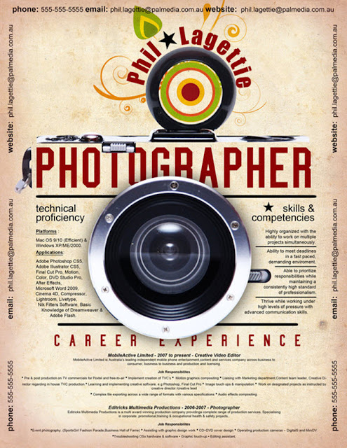
If I could find an object that related to what I want to do that would be able to give the same affect off as the   camera in the image above I would do it. It works really well with the camera!


I liked this one because again, I must just love the pastel colours. I like how the illustrations look hand drawn  and in pencil, which is related to what the individual is specifying in. It is very basic, sweet and elegant.

 I would love to use scrabble letters! Somehow I would like to feature them in my CV, This is a front cover for someone portfolio, It spells out 'Harriet Louise Mills' it isn't obvious but I love the way she has tried to show this.

My Origional CV

This is my CV which I have had for around 3 years now, I have only ever made changes to it when I have gained more qualifications or more work experience.
I would not give this CV in to the fashion industry, I would only hand it in for part time work out of the industry.